Bootstrap warnings and errors
Brief introduction
Bootstrap allows you to perform a successful website or app, warnings and error messages defined styles. In this tutorial, you will learn how to do that.
Create a simple warning
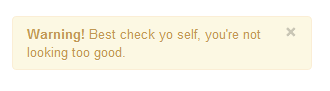
Use CSS class "alert", located bootstrap.css line number 2123-2175 (version 2.0.1), you can create a simple warning. You can add an optional close icon for it.
When you click on the icon to close the alert box, the alert box closes. To achieve this interaction effect, you must add two JavaScript files jquery.js and alert.js. You can add them to the body element to close the front of the label.
Bootstrap create a simple warning message examples
Examples
<Html lang = "en">
<Head>
<Meta charset = "utf-8">
<Title> basic warning message instance </ title>
<Meta name = "description" content = "Creating basic alerts with Twitter Bootstrap. Examples of alerts and errors with Twitter Bootstrap">
<Link href = "/ twitter-bootstrap / twitter-bootstrap-v2 / docs / assets / css / bootstrap.css" rel = "stylesheet">
<Style type = "text / css">
body {
padding: 50px;
}
</ Style>
</ Head>
<Body>
<Div class = "container">
<Div class = "row">
<Div class = "span4">
<Div class = "alert">
<a class="close" data-dismiss="alert"> × </a>
<Strong> Warning! </ Strong> Best check yo self, you're not looking too good.
</ Div>
</ Div>
</ Div>
</ Div>
<Script src = "twitter-bootstrap-v2 / docs / assets / js / jquery.js"> </ script>
<Script src = "twitter-bootstrap-v2 / docs / assets / js / bootstrap-alert.js"> </ script>
</ Body>
</ Html>
Note that the code line number between 18-21 is required. These are just examples to demonstrate.
Export
View Online
See examples above in a different browser window.
Extend a simple warning
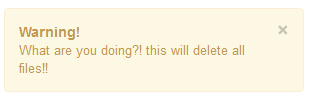
Through two CSS classes "alert-block" and "alert-heading", you can extend simple warning message front presentation. It gives you more control over the text to be displayed, and you can add text captions before the warning text.
When you click on the icon to close the alert box, the alert box closes. To achieve this interaction effect, you must add two JavaScript files jquery.js and alert.js. You can add them to the body element to close the front of the label.
Bootstrap Extended simple warning instance information
Examples
<Html lang = "en">
<Head>
<Meta charset = "utf-8">
<Title> Extended simple warning instance information </ title>
<Meta name = "description" content = "Extending simple alert with twitter bootstrap.">
<Link href = "/ twitter-bootstrap / twitter-bootstrap-v2 / docs / assets / css / bootstrap.css" rel = "stylesheet">
<Style type = "text / css">
body {
padding: 50px;
}
</ Style>
</ Head>
<Body>
<Div class = "container">
<Div class = "row">
<Div class = "span4">
<Div class = "alert alert-block">
<a class="close" data-dismiss="alert"> × </a>
<H4 class = "alert-heading"> Warning! </ H4>
What are you doing ?! this will delete all files !!
</ Div>
</ Div>
</ Div>
</ Div>
<Script src = "twitter-bootstrap-v2 / docs / assets / js / jquery.js"> </ script>
<Script src = "twitter-bootstrap-v2 / docs / assets / js / bootstrap-alert.js"> </ script>
</ Body>
</ Html>
Export
View Online
See examples above in a different browser window.
Create a warning when an error (error), success (success), information (information) occurred
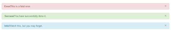
Bootstrap allows you wrong or dangerous, created when a warning message occurs and is successful. For error (error), you'll need CSS class "alert-error". For successful (success), you need to "alert-success" class. For information (information), you need to class "alert-info". Of course, as described in the previous example, you'll need JS file jquery.js and alert.js.
Warning instances Bootstrap error, success and information
Examples
<Html lang = "en">
<Head>
<Meta charset = "utf-8">
<Title> Warning instances Bootstrap error, success and information </ title>
<Meta name = "description" content = "Example alerts on error success and information with Twitter bootstrap.">
<Link href = "/ twitter-bootstrap / twitter-bootstrap-v2 / docs / assets / css / bootstrap.css" rel = "stylesheet">
<Style type = "text / css">
body {
padding: 50px;
}
</ Style>
</ Head>
<Body>
<Div class = "alert alert-error">
<a class="close" data-dismiss="alert"> × </a>
<Strong> Error! </ Strong> This is a fatal error.
</ Div>
<Div class = "alert alert-success">
<a class="close" data-dismiss="alert"> × </a>
<Strong> Success! </ Strong> You have successfully done it.
</ Div>
<Div class = "alert alert-info">
<a class="close" data-dismiss="alert"> × </a>
<Strong> Info! </ Strong> Watch this, but you may forget.
</ Div>
<Script src = "twitter-bootstrap-v2 / docs / assets / js / jquery.js"> </ script>
<Script src = "twitter-bootstrap-v2 / docs / assets / js / bootstrap-alert.js"> </ script>
</ Body>
</ Html>
Export
View Online
See examples above in a different browser window.
Click here to download the tutorial to use all the HTML, CSS, JS and image files.