Bootstrap modal box
description
Bootstrap Modals (modal box) is using a custom Jquery plugin creates. It can be used to create a modal window enrich the user experience, or for users to add useful features. You can use the Popover (pop-ups) and Tooltip (tooltip widget) Modals (block mode) in.
In this tutorial, we will explain some examples and to discuss how to use Bootstrap create modal window. At the same time, we will discuss the various options available for customization.
What is required
You need Jquery, Bootstrap CSS and JavaScript files bootstrap-modal.js. This js file is located in your download folder Bootstrap main js folder.
Bootstrap Jquery located in your home folder in the docs> assets> js under the name jquery.js. Or you can directly access https://ajax.googleapis.com/ajax/libs/jquery/1.7.1/jquery.min.js download Jquery.
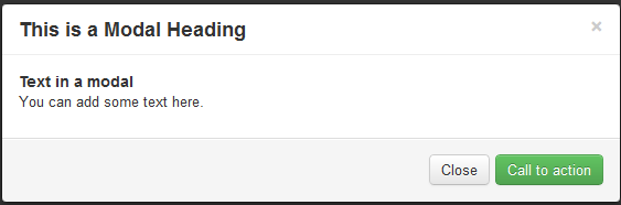
Bootstrap Modals (modal box) look like
The following example demonstrates Bootstrap Modals (modal box) looks like.
Use Bootstrap Modals (modal box) on your website
The following example demonstrates how to use Bootstrap Modals (modal box) in the page. Note that you do not need to write any JavaScript code. Examples behind with related interpretations.
Examples
<H2> using Bootstrap create modal frame </ h2>
<Div id = "example" class = "modal hide fade in" style = "display: none;">
<Div class = "modal-header">
<a class="close" data-dismiss="modal"> × </a>
<H3> What is a modal box title </ h3>
</ Div>
<Div class = "modal-body">
<H4> text </ h4> modal box
<P> You can add some text in it. </ P>
</ Div>
<Div class = "modal-footer">
<a href="#" class="btn btn-success"> wake activity </a>
<a href="#" class="btn" data-dismiss="modal"> Close </a>
</ Div>
</ Div>
<P> <a data-toggle="modal" href="#example" class="btn btn-primary btn-large"> launch demo modal box </a> </ p>
</ Div>
<Script src = "https://ajax.googleapis.com/ajax/libs/jquery/1.7.1/jquery.min.js"> </ script>
<Script src = "/ twitter-bootstrap / twitter-bootstrap-v2 / js / bootstrap-modal.js"> </ script>
View online Bootstrap Modals (modal box) Examples
Explanation
The following table explains the above code. It will help you understand how to use Bootstrap Modals (modal box).
| 代码 | 解释 |
|---|---|
| div id="example" | 分配给相关 div 的 id,id 的值指向后边要实现 modal(模态框)的 JavaScript。 |
| class="modal hide fade in" | Bootstrap CSS 的四个 class - modal、hide、fade 和 in,用于设置 modal(模态框)的布局。 |
| style="display: none; | 用于保持模态窗口可见,直到触发器触发(比如点击相关按钮)。 |
| <div class="modal-header"> | modal-header 适用于定义模态窗口标题样式的 class。 |
| a class="close" | CSS class close 用于设置模态窗口关闭按钮的样式。 |
| data-dismiss="modal" | data-dismiss 是一个定制的 HTML5 data 属性。用于关闭模态窗口。 |
| class="modal-body" | modal-body 是 Bootstrap 的一个 CSS class,用于设置模态窗口主体的样式。 |
| class="modal-footer" | modal-footer 是 Bootstrap 的一个 CSS class,用于设置模态窗口尾部的样式。 |
| class="btn btn-success" | CSS class btn 和 btn-success 用于在模态窗口的尾部创建一个大号的按钮。您可以使用任何其他 Bootstrap 按钮代替。 |
| class="btn" | Bootstrap CSS 的 按钮 class btn,用于在模态窗口的尾部创建一个小号的按钮。 |
| data-dismiss="modal" | HTML5 定制的 data 属性 data-dismiss,用于关闭模态窗口。 |
| data-toggle="modal" | HTML5 定制的 data 属性 data-toggle,用于打开模态窗口。 |
| class="btn btn-primary btn-large" | 设置按钮样式,点击该按钮则创建模态窗口。 |
| <script src="https://ajax.googleapis.com/ajax/libs /jquery/1.7.1/jquery.min.js"></script> |
引用 Jquery 文件。 |
| <script src="../bootstrap/twitter-bootstrap-v2> /js/bootstrap-modal.js"></script> |
引用 bootstrap modal(模态框)的 JS 文件。 |
Using JavaScript
You can use JavaScript to achieve Bootstrap modal window. Only you need to call in your JavaScript modal in () can be. Your code looks like, you can body end tag (ie </ body>) before referencing it.
 $ (Function ()
{$ ( "# Identifier") modal ().;
});
Wherein the identifier is a Jquery selector for the container element identifies relevant. Next, we take a look at what are the options.
Options
Here are some through modal () when the modal window customize the look and feel are likely to use options.
backdrop
backdrop option contains a modal-backdrop element.
If you put "using JavaScript" code 2 instance row number Replace the following code, that is, to assign backdrop option is false, this case does not exist any modal-backdrop.
{$ ( "# Example") modal ({backdrop: false}).;
keyboard
If you use the keyboard options, click on the escape when you close the modal window. Its type is boolean, the default value is true. If you set the value of keyboard option is false, it will not escape this time even if the click Close modal window.
If you put "using JavaScript" code 2 instance row number Replace the following code, that is, to assign keyboard option is false, it will not escape this time click Close modal window.
{$ ( "# Example") modal ({keyboard: false}).;
show
If you use the show option, when initialized modal window is displayed. Its type is boolean, the default value is true. If you set the value show option is false, when initializing the modal window will not be displayed.
If you put "using JavaScript" code 2 instance row number Replace the following code, that is, to show the options assigned false, it does not appear in the initialization modal window.
{$ ( "# Example") modal ({show: false});.
method
Here are some to use by modal () method.
.modal (options)
The method of activating the contents of a modal (modal box). You can reference an optional parameter object type options. If you're in this tutorial the first instance of the </ body> Add the following code before the tag at this time does not exist any modal (modal box) backdrop element.
$ ( '# Example'). Modal ({
  backdrop: false
})
.modal ( 'toggle')
The method of manually switching a modal (modal box). If you're in this tutorial the first instance of the </ body> Add the following code before the tag, you can manually switch modal (modal box).
$ ( '# Example'). Modal ( 'toggle')
.modal (show)
This method can be used to manually open a modal (modal box). If you're in this tutorial the first instance of the </ body> Add the following code before the tag, you can manually open the modal (modal box).
$ ( '# Example'). Modal ( 'show')
.modal (hide)
This method can be used to manually hide a modal (modal box). If you're in this tutorial the first instance of the </ body> Add the following code before the tag, you can manually hide modal (modal box).
$ ( '# Example'). Modal ( 'hide')
event
Here is Modals (modal box) related events. These events are used to intercept and execute their own code.
show
When an instance method is called after the show, this event is triggered immediately.
shown
When the modal box is displayed after (and CSS transitions have been completed), this event is triggered.
hide
When the hide instance method is called, this event is triggered immediately. Immediately after the hide instance method has been called, this event is called.
hidden
When the modal box hidden from the user (and CSS transitions have been completed), this event is triggered.
Click here to download the tutorial to use all the HTML, CSS, JS and image files.